A great landing page is a key to a successful website. It’s the first thing people see when they visit your site, and it’s what makes them want to stay, but how do you create an effective landing page?
A well-designed landing page will include a clear call to action, persuasive copy, and relevant images. It should be easy to navigate and should load quickly. If you’re not sure how to create a landing page that converts, there are plenty of resources available online. With a little effort, you can create a landing page that will help you achieve your business goals. Here are ten design concepts to keep in mind while designing your landing page.
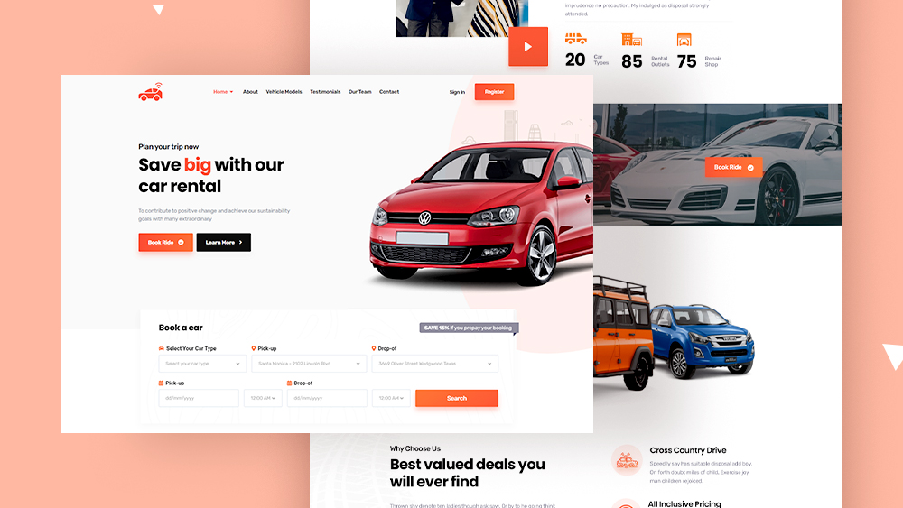
Car Rental Services
Your company’s landing page is the first impression potential customers will have of your business. Make sure it is a good one! The landing page should be easy to navigate, with a clear call to action and all the information a customer needs to make a booking. Most importantly, it should be visually appealing, with high-quality photos and videos that show off your cars in their best light. If you can create a landing page that makes a great first impression, you’ll be well on your way to driving bookings and revenues.
The provided example shows how copy can be used to create an engaging landing page for a car rental app. It uses considerable amounts of text and visual elements in order to persuade users to take action on the website, such as signing up or making sure they are properly informed about any questions they might have. It’s important not only to provide concise information but also to make sure there isn’t too much verbiage so people don’t get bored when reading through your message.
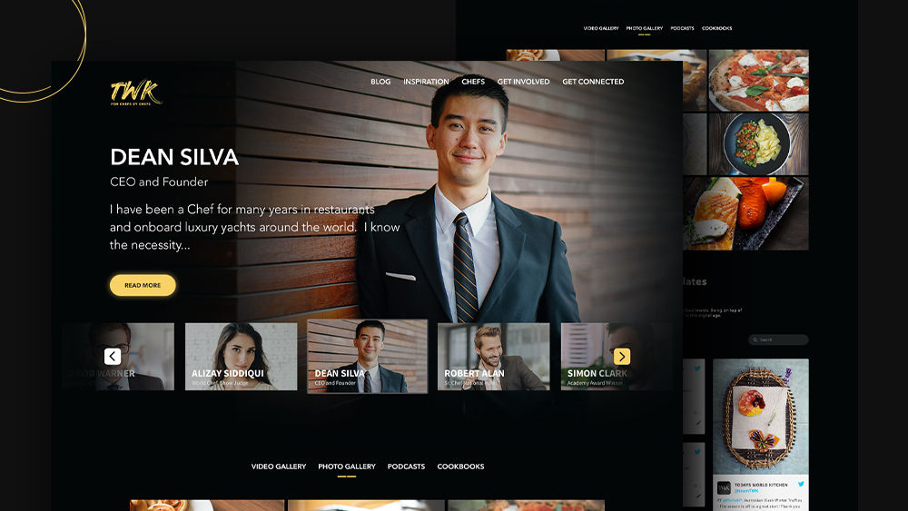
Dark Theme
Dark colors can be a powerful brand statement. This is because of their association with elegance and mystery, as well as the ease at which they command respect – especially in interfaces where light backgrounds would draw attention away from other elements on your page (like a copy). A great way to use dark background designs for sleekness when designing products? Make sure there’s enough contrast between its darkness versus something else nearby, like white text or images!
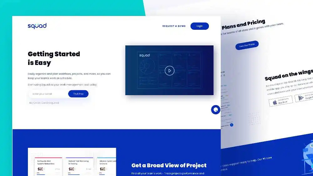
Project Management
The landing page for this project management portal is designed to have a strong first impression and ensure the customer has an enjoyable experience while working on this site. The color scheme uses different shades in order to create depth, which also helps with readability by providing contrast between fonts or other elements on screen that might otherwise blend together seamlessly due to only having one main background texture image repeatable across all web pages within your website portfolio.
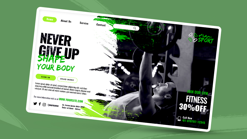
Fitness And Workout Training
The fitness and workout app’s landing page features a professional yet engaging interface with subtle color accents and motion effects. The fitness experience is made smoother by using bold fonts for key messages that are easy to read while creating an obvious perception of the theme through motivating images throughout the design presentation and fun colors and blurbs to help motivate the user to complete their fitness regime.
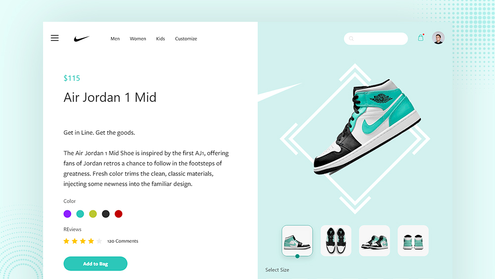
Nike Shoes
The page includes a general description of the Nike shop and presents an opportunity to transition into catalogs via special offers and also has a testimonials part that provides users’ opinions about services. A good combination of visual elements on backgrounds together with dynamic photos provides a clear setting for the theme while supporting a strong associative link intended towards potential buyers engaging them by informing nature offer in detail. The design is minimal, modern, and easy to use without any distractions.
