A well-designed call-to-action button can be the difference between a successful conversion and a missed opportunity. CTAs are an important part of any good user experience, so it’s important to ensure they’re effective. The CTA tells the user what to do next, and it should be designed clearly, concisely, and effectively. The call-to-action button is one of the most important design elements in any business. A compelling enough portrayal can entice potential clients to click and go right into completing whatever form you have asked them about or even making an order for your product!
Here Are Five Tips For Designing Effective CTA Buttons:
Keep It Simple
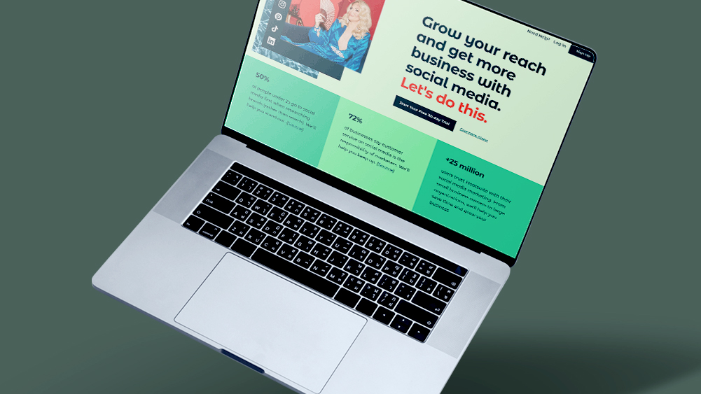
The first rule of thumb regarding the CTA button design is to keep it simple. The more your design edges minimalism, the more well-received it will be. Your CTA button should be easy to understand at a glance and free of any clutter or distractions. It should have a pull to it, the text on your button should be clear and concise, and the overall design should be clean and uncluttered.

Make It Stand Out
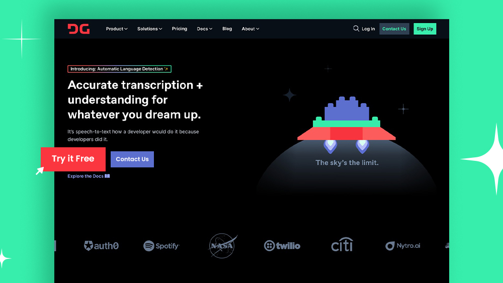
Your CTA button should stand out from the rest of your page so that visitors can’t help but notice it. This means using contrasting colors and/or shapes so that your button stands out from the background. Using large buttons is an excellent way to get attention and encourage interaction. You should remember that these are only effective when they’re both easy enough for users with disabilities and those who simply don’t want any distractions during their browsing experience. Some experts recommend 44×44 pixel CTAs on mobile UIs, while others say it’s best between 34Х26 pixels depending upon your specific needs and what kind/size device you’re looking at. Additionally, you may want to consider using animation or other visual effects to grab attention further.

Use Actionable Language
The text on your CTA button should be actionable and encourage visitors to click through. Common phrases used in CTA buttons include “Learn More,” “Download Now,” “Sign Up,” and “Get Started.” Whatever you choose to put on your button, make sure it’s something that will prompt visitors to take action.

Use Negative Space
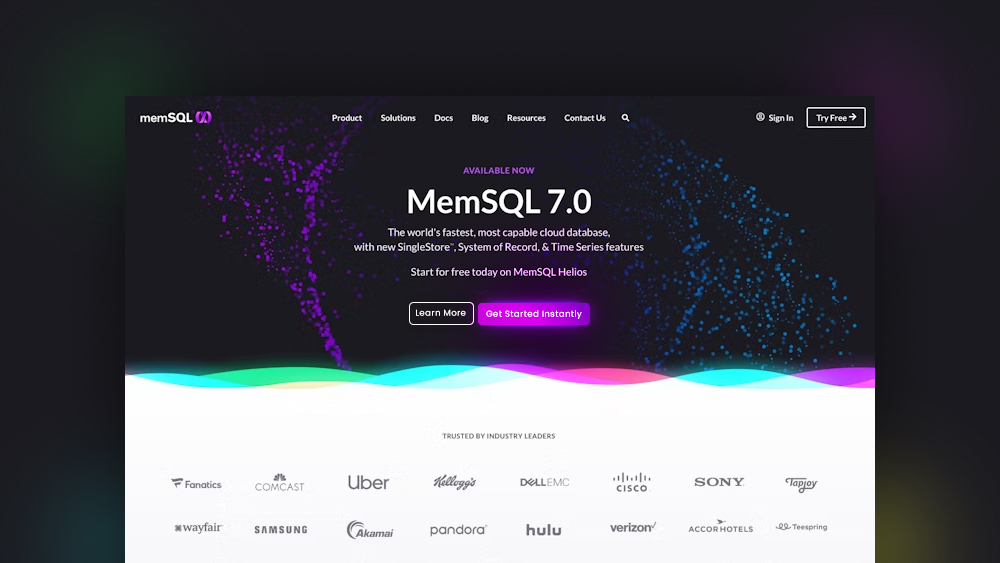
Using negative space is a great way to make your CTA button pop. By surrounding your button with plenty of white space, you can create a sense of visual contrast that will make it stand out even more. Just be careful not to use too much negative space, as this can make your button appear lost on the page.
White space is a powerful tool that can be used to emphasize UI elements. When there are many visual components on an interface, such as CTA buttons and other important information in close proximity that may get lost if not styled properly with enough white margin around them; then using this technique will make sure people don’t miss what you’re trying to convey because their attention becomes drawn towards the emphasis provided by its surrounding area- which makes these types of designs perfect for calls-to actions!
Test It Out!
Finally, remember to test different versions of your CTA button to see what works best for your audience. Try different colors, text, shapes, sizes, and placements to see what gets the most clicks. Then, once you’ve found a winning combination, stick with it!
UI design is all about knowing your audience. User research and analysis help designers understand what they need to create for people like you. Still, it would be easier with testing our designs against real-life users who can give us valuable feedback on how well certain decisions work out in practice – which means tests could become a necessary solution if we want to confirm whether something actually performs as expected or not!
Following these simple tips can help you design effective CTA buttons that drive results. Remember to keep it simple, make it stand out, use actionable language, use negative space wisely, and test different versions until you find a winner. Implement these tips on your next project and see how they can help you boost conversions! Learn more about UIUX from our previous blogs!