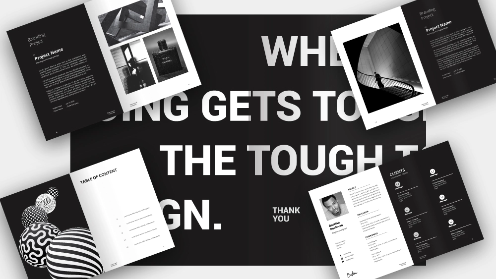
In today’s competitive digital landscape, it’s essential to create a portfolio that stands out from the crowd. To set yourself apart, you must create a portfolio that is both visually attractive and user-friendly. The 12 Universal Design Principles provide a framework to help you achieve this. By applying these principles, you can create a portfolio that is aesthetically pleasing, user-friendly and engaging, helping to ensure that your portfolio stands out from the crowd. From color schemes and typography to grid layout and white space, you can use these principles to create a portfolio that reflects your unique style, is easy to navigate and conveys the message you want to send to potential employers or clients.
Color Schemes
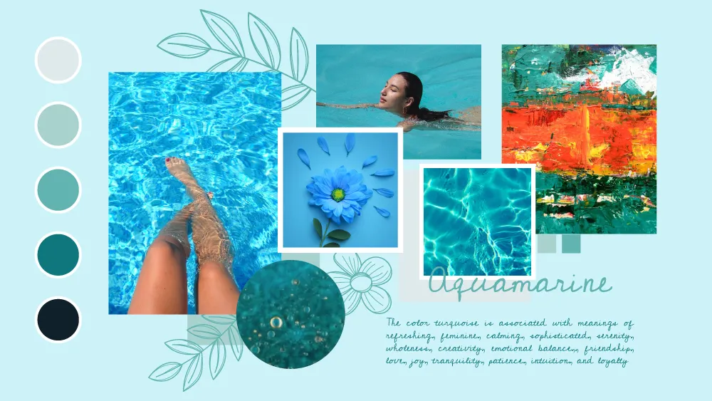
Color schemes are key to creating a visually attractive design and can have a big impact on how people feel when they visit your portfolio. Therefore, it’s important to choose colors that work well together. When choosing a color scheme, it’s important to choose colors that work well together and create a balanced design. When designing a website, it’s important to know which colors to avoid, as some colors may clash with others. When choosing a color scheme, you need to consider the following: – The significance of the colors you select. – How the colors will look when used together. – How the colors will look when used on different devices. – The color palette of your brand. – The color palette of your client’s brand. By considering these factors, you can create a color scheme that looks great and works well with the design of your portfolio.
Typography
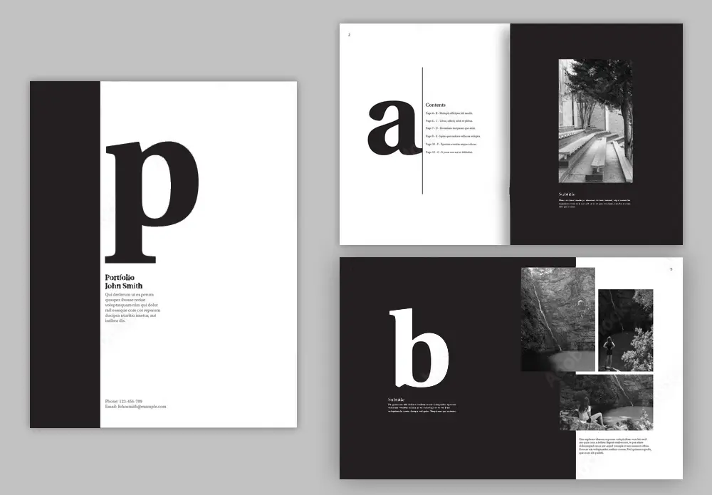
Typography can be used to enhance the design of your portfolio, and it can also be used to convey certain messages and inform visitors about your services. To do this, you need to select fonts that complement your color scheme and that resonate with your target audience. In addition to using fonts that are aesthetically pleasing, it’s important to select fonts that are legible. When choosing fonts, make sure they are large enough to be read on smaller devices, and select fonts that are written in a clear and easily readable manner. If you’re not sure which fonts to select, you can use font pairing websites to discover which fonts look good when used together. In addition to font pairing websites, there are many font selection tools available online that allow you to select a font based on specific criteria, such as the font family, font weights and recommended uses. By selecting fonts that are legible and look good when used together, you can create a design that is both aesthetically pleasing and user-friendly.
Grid Layout
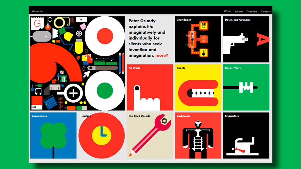
Grid Layout is a design concept that is used to create a consistent and visually attractive design. It is a layout that divides a page into sections, or “columns”, which are equally separated by “gutters”. Grid layouts can be used to create a user-friendly portfolio, as they make it easy for visitors to navigate to the different pages of your portfolio and see your work in a logical and consistent way. Visitors to your portfolio expect to see certain sections, such as your “About Me” and “Services Offered” sections, but they also expect to see these sections in a consistent format throughout your entire portfolio. Grid layouts help to achieve this consistency and make it easier for visitors to navigate through your portfolio. It also allows you to increase the amount of information you can display on each page. This can be useful if you want to include large images or “call-to-action” buttons in your design.
White Space
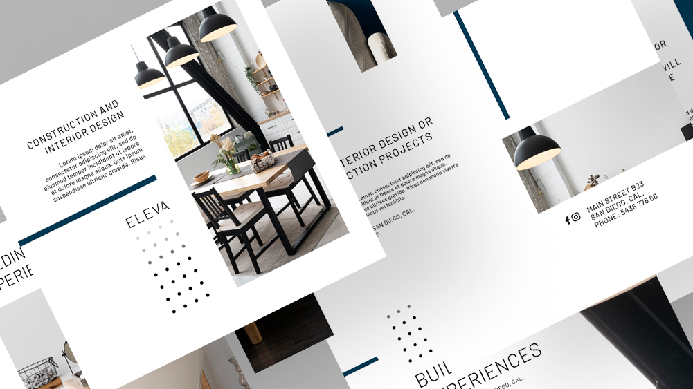
White space is an important design concept that can be used to create a visually attractive design. It is the empty space between elements in your design, such as images, text and other content. White space has several functions, including giving your design a clean and uncluttered look, increasing visual interest, adding balance to your design, improving readability and aiding navigation. White space is an important design concept, as it can be used to create a visually attractive design, improve the user experience and enhance the message you are trying to convey. It also makes your design look cleaner and uncluttered and can make your portfolio easier to navigate. A portfolio that is visually pleasing and easy to navigate is beneficial, as it helps to keep visitors’ attention and makes it easier for them to stay engaged with your portfolio.
Contrast
Contrast is the difference between two or more elements. The principle of contrast can be used to create a visually attractive design. When applied correctly, contrast can be used to highlight important elements, such as call-to-action buttons, and create visual interest. There are various ways in which you can use contrast to create a visually attractive design. You can use color contrast to highlight key elements, such as your “About Me” and “Services Offered” sections. You can also use font contrast to draw attention to certain elements; for example, you can use a bold font to draw attention to your “Services Offered” section instead of using color to highlight it. You can also use visual contrast, such as a dark background with light text, to create visual interest and draw attention to key elements. Contrast can also be used to create a visually pleasing design by creating sections that stand out from each other. For example, if you want to highlight your “About Me” section, you can use color contrast to make it stand out from the rest of your design.

Responsiveness
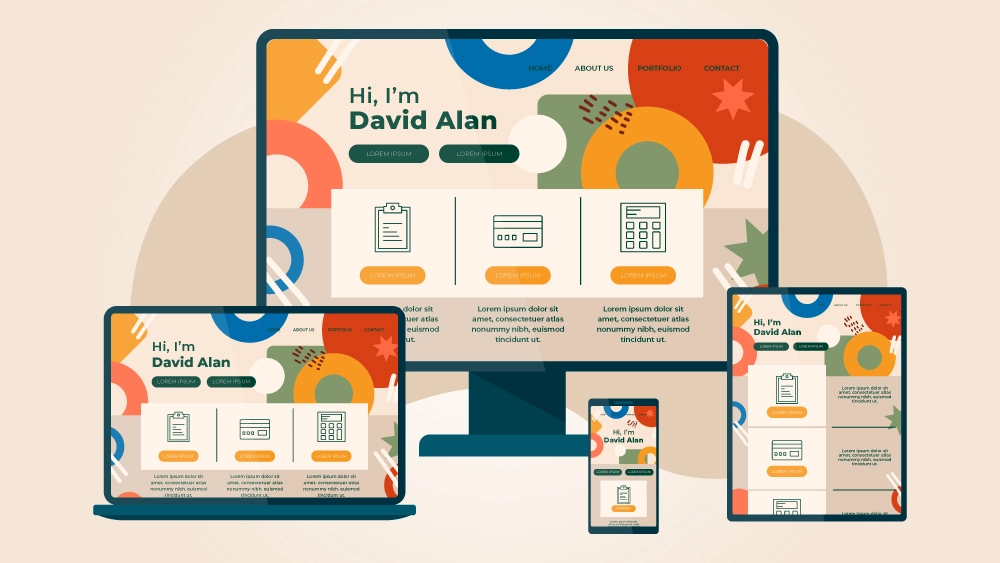
The number of people accessing the internet via mobile devices is set to increase, and more employers are also using online portfolios to find candidates. As a result, it’s important to ensure that your portfolio is responsive so that it is optimized for all devices and can be accessed on any device. It’s also important to note that Google favors mobile-friendly websites, which makes responsive websites even more important. There are different ways in which you can make your portfolio responsive, such as adjusting the font size, adjusting the color scheme, and using a grid layout. You can make your portfolio responsive by using clear and legible fonts in large font sizes, using color schemes that work well on smaller devices, and using a grid layout that is easy to navigate on small devices.
Consistency
Consistency is a key principle of design, as it helps to create a visually attractive design that is easy to navigate. Consistency can be applied to all elements of your portfolio, including your color scheme, font choices and design elements. This creates a consistent design that is easy to navigate and would be familiar to visitors. When designing your portfolio, you can use consistency to create a visually attractive design that is easy to navigate. For example, if you are using a certain color scheme throughout your entire portfolio, visitors would be able to easily navigate between each page, as the color scheme would remain consistent throughout. Consistency can also be applied to your font choices, such as the font used for your “About Me” section. This consistency helps to create a visually attractive design that is easy to navigate.
Accessibility
Accessibility can be applied to various elements of your portfolio, such as the structure of your website, the length of your content and the use of colour. By applying accessibility principles, you can make your portfolio more accessible to as many users as possible, and this can be beneficial, especially if you plan on using your portfolio to apply for a government position that requires you to use a government website. By applying accessibility principles, you can make your portfolio more accessible to people with certain disabilities, such as those who are vision-impaired. To do this, it’s important to follow best practices when designing your portfolio. For example, you can use a color scheme that can be read by people with certain visual impairments and keep your content short and concise.

Simplicity
Simplicity or minimalism is a design concept that can be used to create a visually attractive design. It is important to remember that less is more when applying simplicity to your design. This means that you should only use elements that are necessary and avoid adding superfluous elements. Simplicity can be used to create a visually attractive design that conveys a clear and concise message. To create a simple design, you can simplify your color scheme, typeface and image selection. You can also simplify your content by keeping it concise and not including unnecessary information that would distract visitors from your core message. By applying simplicity to your portfolio design, you can create a visually attractive design that conveys a clear message.
